trnsit - my first experience with SwiftUI

I travel daily to go to work and use public transport to do it. The SBB mobile app is quite good but has some weaknesses.

Link to the AppStore: https://apps.apple.com/ch/app/trnsit/id1495557079?l=fr
- First, let's imagine it's a rainy day or a freezing one, getting your phone out of your packet could be a tedious process.
- Secondly, the amount of time needed to see the next trains departing Bern or Zurich for Biel is quite a lot. You have to tap on the timetable option, then input or choose your starting point from a dropdown list, then basically re-do the same thing for your destination. Many taps are needed to accomplish a small task.
Design
I have sadly the habit of searching or designing a logo, first, before laying the ground for the project. A bunch of good ideas do not see the light of day because I wasn't satisfied with the project's logo.
this image hurts pic.twitter.com/j4L8OSHV92
— Kitze (@thekitze) September 17, 2019
I’m not at all a designer, but Sketck makes super duper easy for a noob to whip up a somewhat decent logo in a couple of minutes/hours.
Here’s the final result:

Good enough!
Choosing an API
Before starting coding, I had to compare three available options for retrieving data:
- Opentransportdata: a public API offered by the SBB (Swiss National Railway Company). It outputs XML responses (😢), and the developer documentation is in German.
- Google Maps API: it's not suitable for this kind of project. The transit request only returns one response. I need more.
- Search.ch ✅: has very concise documentation, it's written in English and for the bonus point, returns a JSON.
ِAdios MVC?
With SwiftUI, it seems as if Apple is pushing developers to move towards an MVVM architectural pattern.
The pattern simplifies the design of event-driven applications by offering a transparent dependency model between components and the flows of data between them.

The model represents the manipulated object. The ModelView handles, for example, the API calls and exposing the model objects to the View to display.
The binding protocol allows the model to force the View to update whenever there's a mutation. It was on part possible when Apple introduced Combine at WWDC 2019. Combine is a reactive framework that is based on ReactiveX, and aims supposedly to replace RXSwift and bumps it to a first-party library.
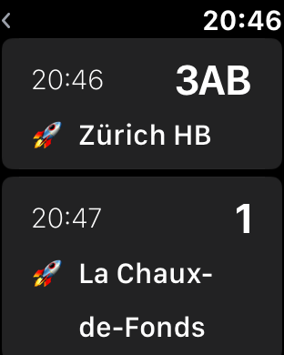
Screens


Final thoughts
Writing SwiftUI code was a delightful experience, way less painful than using the Storyboard. Well, you can also declaratively describe your views before, but this new way of writing views is more maintainable in the long term.
The Xcode Preview panel is also a delight. No need to run your application on a simulator to see if every UI component is on its place. Just mock the model property in your ViewModel, and you are good to go. You can also see all the different variations of your view by wrapping them inside of a Group.
The only thing left to do now is to prepare the watchkit app for the Apple Store. I hope that other Apple watch users will find it useful 🤞🏼.
References
- https://developer.apple.com/tutorials/swiftui/tutorials
- https://developer.apple.com/videos/play/wwdc2019/219/
- https://developer.apple.com/documentation/watchkit
- https://heckj.github.io/swiftui-notes/
- https://adrianhall.github.io/swift/2019/11/05/swiftui-location/
Updates
- I wasn't very satisfied with logo's main colour so I change it to blue (my favourite colour btw). I have also scaled up the logo to fit its box.

- The remote debugging experience is a nightmare. According to Apple, Xcode should be able to launch my application on my Apple Watch and be able to see all of my print logs, but NO. If I am not mistaken, I was only able to do it once or twice. I have tried everything (see this thread on SO), submitted a bug to Apple. Their response was to basically tell me to: reset my router, forget the wifi hotspot on my device and restart device. This wasn't helpful at all.